Story Selection
The same sex story was a great example of a story important to a marginalized community and yet interesting to the larger community as well. Not only was it a good localization of a state and national issue but you scooped the other local papers and told people exactly how they could get involved.
Design
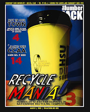
Overall nice layout. The cover was compelling and creative. The page three layout looked nice. Fantastic design of the sports spread and fun design of the Rocky Horror show preview.
Nice use of breakout boxes, but I'd like to see fact boxes in even more stories.
Ledes
I noticed some better ledes this time around:
- First comes love, then comes marriage, then comes the baby in the baby carriage.
- It's time to kick up your high heels and flash those garters!
Clarity
The parking story had some good information in it but it was a confusing read. To begin with it is a story about a parking problem so you needed to focus on parkers. Instead you focused on Chief Dewey.
It would have been great to meet two of them -- one who can't find a spot or who has to walk far for one and another who has a system for scoring great parking. It would have been great to have a Question of the Week for people on how they manage the parking problem.
The story also needed numbers:
- How many parking spots are there and how many permits does the school issue?
- How much money does the school bring in from citations?
The Rocky Horror story was also confusing. It begins as a preview of a live show but then digresses to the movie so the reader wonders live show or movie? Since its Rocky Horror, will they be performing live against the backdrop of the movie? Its entirely unclear. This is a case where you needed to slow down and explain what exactly readers can expect to experience if they go to the show.
Filler
There were too many house ads in this issue. House ads tell the reader that you couldn't think of one single thing to put in that space. Start thinking about extra space in creative and useful ways. Perhaps you could use them as public service spaces and give worthy non-profit causes some needed publicity. Let readers know how they can donate food to the Arcata Endeavor for example or volunteer at the Food Bank. Or you could give them thought provoking quotes from famous people. Or you could snap photos of students' dogs or children. The bottom line: Value your newsprint.


1 comment:
Post a Comment